Tuesday, November 13, 2012

Barely Treading Water...

{image credit:  J.Pat Carter from here
 
say some prayers for me. ;)
 

Saturday, November 10, 2012

Thanksgiving Pilgrim Hat Dessert


I have been making these Pilgrim hats for several years and they are always a big hit at Thanksgiving. And the best part is, they are EASY!

You will need:

  • Chocolate cookies (I used Keebler Striped Shortbread and turn them over)
  • Reese's individually wrapped peanut butter cups (unwrapped) :)
  • Orange frosting in a tube


Place the cookie striped side down, put a little frosting under the Reese's Peanut Butter cup. Set that in the center of the cookie.


Take the orange frosting and put a bead around the bottom of the Reese's.  Make a square on it to be the buckle.  And you're done!  How much easier could that be?!


Some of the orange frosting looks a little crazy, but I don't worry too much.  As soon as the kids see them, they're gone--crazy buckles and all!
 
 
Thanks for your visit!
 
Pam


I am linking to the following parties:

Debbiedoos Newbie Party with a Twist


Friday, November 9, 2012

Our Kitchen Plans... from restaurant sketch conception to real life kitchen!!

Life has been so hectic lately but things are great overe here.  I feel like I can barely catch a breath (more the combination of work & under-construction-home-baby-life than the house itself) but I really am loving seeing everything come to life around us.  Our kitchen cabinets arrived & the frames have been installed!!!  It's really starting to take shape!!!  Here's what our kitchen looked like before:

 
We completely removed the wall between the kitchen and the living room to create one big open room.  Here's the wall "before"--
 
 
We, like most families, spend a ton of our time in the kitchen, so I wanted to make it a little larger and I also didn't like the fact that once the wall between the kitchen and the living room was removed, you'd be looking at the side (sliced) view of both the kitchen & the dining room so I decided to move the kitchen wall two feet over (stealing from the dining room) so that the kitchen would span the entire width of the living room.  We also rearranged the general layout of the kitchen.  Here are the plans drawn up by CarrMichael Construction:


We got rid of the peninsula in the kitchen separating it from the breakfast room because I've always wanted a stand-alone island and because I wanted it feel more like one large space instead of kitchen & breakfast room.  The island visually separates the living room from the kitchen just the right amount & without it, I think it might feel a bit too much like you were cooking in the living room. 

Mike (owner of CarrMichael Construction) has been amazing with helping us plan the kitchen and is really great with scale & space. (His wife, Tara, has been amazing too, in feeding us while our house is under construction!!  She's also become a close friend and is the type of person who thinks nothing of last-minute late-night "emergency" shopping trips - yes I know a shopping trip isn't ever really an emergency but to a post-pregnant lady with a photo shoot the next day, it feels pretty close!- and is always there when you need her.)

Here's what the kitchen is looking like now:


Here's an example of the type of direction Mike gets on the kitchen from me:

{nothing better than plans conceived while eating at a restaurant...  I think the first set of "plans" Mike got from me were scribbled on the kids menu of Uncle Julio's while we were all out with the kids. }

me- "Ok, Mike, got it??"
Followed by his laughter...

...And then this is what he gives back to us:


(I drew a little on the hood in the pic to show you the actual shape of the hood...  The draftsperson used a generic hood from the program that was curved & we're going straight.)

..Just what I meant by the scribbled sketch = yay!!!

And this is what happens:


The island will be all drawers and will be built out of horizontal panels of reclaimed wood.  (Even on the drawer faces)  What you're seeing in the current photos is the drawer boxes which will be hidden by the reclaimed wood panels.  I'm a big fan of drawers in kitchens (especially for kitchens with kids because they're easier for them to keep organized & access) and so everywhere we can do a drawer, I've done one.  The island is full of storage:


We've also been working with Tom Owens of Owens Iron Works in Herndon (who is also doing our stair rails).  The shelves will attach into the ceiling and into the marble countertop like this: (this is a side view)

 
Tom & the team at Owens are true craftsmen & I can't wait to see the shelves!!  We'll have wooden shelves inset into the iron frame for a soft landing for dishes, mixing bowls & drinkware.
 
Here's the view into the kitchen from the breakfast room originally:
{Am still loving the previous owners' vintage barstools and am keeping them, maybe playing with the stain.  Thank you to them!!!}


...And here's the view now:

renovation plans


There won't be any upper cabinets in the entire kitchen and I'm leaving the wall above the sink empty so I can pack it with my collection of vintage oil paintings.  The kitchen is generally very clean & simple so I want to introduce a slight bit of mayhem/clutter/color  in there above the sink.  The paintings also feel more "living room" less "kitchen" to me so I think the painting wall will bridge the kitchen-living-room-gap nicely.

An important thing to me in kitchens (and any room really) is that each view or elevation looks good and is functional.  I really wanted a centered range & hood for the kitchen's focal point and this meant moving the sink to the other wall, however, I didn't like how it would be squeezed in next to the refrigerator and also wanted the sink wall to be pretty (&functional!!)....   So, we moved the fridge over into the original pantry area (seen below where the white doors are.)
 
I thought & thought about how far away the fridge would be from everything else & finally deicded that as long as we found one with an icemaker & water, we'd be okay with it being so far from the sink.  Here's the slot for our new (smaller) fridge:

{We added a second window in the breakfast room for balance and because we wanted a better biew into the yard.  We've added windows wherever possible in the house.  It makes SUCH a difference and everywhere I look when I'm inside, I see outside.}

....Now that it's in, the refrigerator actually doesn't seem far away at all, so I am so happy we made the move.  It also helps to expand the kitchen itself beccause we added cabinets & a countertop next to it for storage & space to set down groceries and prep.  (A lazy susan is in the corner for our canned food.)  The microwave is under the counter beneath the window, which is great because now someone can grab something from the fridge, heat it up in the microwave and not even have to go near the main cooking area.

I'm selecting paint for the perimeter cabinets (drawers really) today so wish me luck!!  I'll keep you posted!!  Also, thank you so much for the kind words about the FW Magazine cover...  It was a really fun experience!!


If you'd like help creating a home you absolutely love, contact me about our design services.

Wednesday, November 7, 2012

Holiday gift guide! If you're in DC...

...Check out the Washington Post today!  There's a special issue of FW Magazine ("Fashion Washington") included inside where I and 3 other local bloggers share our holiday gift ideas.  Here's the cover:

Childrens Gift Guide
 
 
The told us to give our best "Christmas morning" expressions... 
(Apparently, Santa leaves me shockingly good presents under the tree.)
 
I met Grant Harris (who's next to me on the cover) the day of our shoot & he is honestly the best dressed  guy I've ever met in "real life."  Grant writes Image Granted, a menswear blog & runs a menswear consulting firm.  I can't wait to have him meet my husband & work his magic.  (I actually love how Dave dresses but I know Grant will make it even better = good-and-not-a-surprise-for-him- Christmas gift ;) ;)   
 
Also inside are gift guides by Jenna Golden of Eat More Drink More and Elizabeth Fassbender of So Much to Smile About, and Grant & me.  I was selected to pick out the children's gifts.  (Which is really funny to me, because as most of you know, I'm more into kids toys that look good if left on the floor rather than toys that kids are really into;) ;)  But seriously.... no, I'm serious.
 
I'll be sure to share more about my kids' gift ideas sometime after Thanksgiving... I found some ones that I think most kids would looove (and of course, more importantly ;) ;)  .. that you won't mind seeing strewn about your house.)
 
  The article was written by Holley Simmons & I have to say (being extremely uncomfortable in my post-baby-not-fitting-into-my-clothes-yet-body) the team at the Washingto Post was amazing--the editors, photographer, stylist & hair & make-up team- in making me feel okay.  It's a pretty large magazine and might look like an ad (my grandfather was throwing it away today when he looked down & saw my face) but definitely check it out if you get the chance!!


If you'd like help creating a home you absolutely love, contact me about our design services.

Tuesday, November 6, 2012

Make a Statement with an Area Rug


No matter how much you love the furniture in your living or dining room, the space can look bare if you don’t have attractive floor coverings to complement the rest of the room. An area rug can add character to any room, creating a statement that reflects your personality and style. Here are some tips for using an area rug to make the statement that you want to make about your home.

Be Bold!

To make a strong statement using an area rug, choose bright colours and bold patterns. Patterns work particularly well if your walls and soft furnishings are plain. Geometric patterns featuring contrasting colours are modern and look stunning when offset by white walls and understated furniture. Black and white patterns are particularly striking, particularly when used as part of a minimalist setting. Meanwhile, floral and oriental patterns are a tasteful accompaniment to traditional furniture and décor styles.

Choosing Colours

There are two strategies to choosing the colour of an area rug; you can either choose colours that blend in with their surroundings or instead opt for a startling contrast. If your room is filled with dark wooden furniture, a bright orange rug can create a warm, autumnal atmosphere – perfect for relaxing in comfort on cold evenings. Alternatively, pair a bright yellow, blue or green rug with white or light-coloured walls to create a fresh, spring-like environment.

Selecting Shapes

Area rugs come in a wide range of shapes, so they can be used in almost any room. A rectangular rug is the perfect choice for a sophisticated dining room, as it reflects the shape of a long dining table. Living room furniture works best when it is arranged around a square or circular rug. Match the shape of the rug to the shape of your coffee table to add consistency of style to your home.

Cosy Comforts

Although wood floors and tiles offer many practical advantages over fitted carpets, they can feel cold underfoot. An area rug is a perfect solution, creating a cosy atmosphere that is welcoming and homely. Area rugs also protect your floor from being scratched by furniture legs dragging across the floor. The result of adding an area rug is a soft environment where noise is dampened and your feet are kept warm.

Don’t Limit Yourself

If you have a large room, for example a combined living and dining room, there is no need to limit yourself to just one area rug. Use two or more matching rugs to soften your living space and add attractive splashes of colour.

Unleash Your Creativity

Choosing an area rug is your opportunity to customise your living space without needing to spend a lot of money or put up with the inconvenience of building work. Choose an area rug that matches your personality and style.

Guest post contributed by Jonathan Azevedo on behalf of http://www.arearugs.com
Jonathan is a freelance writer with a penchant for interior design. His articles mainly appear on design blogs.

Monday, November 5, 2012

Things To Consider Before Home Remodeling

No matter what the pressure home remodeling CA can bring, homeowners have the modest hope of achieving the best for their house. Why many consider Bay Area home remodeling is, perhaps, because of its effective method that guarantees a highly satisfactory output.

Home remodeling is a perfect opportunity to upgrade your home’s selling value by restructuring it. A well-maintained home yields better functionality and long-term financial returns, yet one must be able to point out the reasons behind wanting a new look for his home. 

You can have one, two, three, or all areas of your house remodeled. Make up your mind before getting down to the project. Check your finances to see if it can manage a Kitchen remodel in Bay Area or, perhaps, bathroom remodeling. These areas normally undergo remodeling and many homeowners don’t mind shelling out money for the improvement of their kitchen and bath. While the improvement of these rooms add value to your home, think about what you can get in return. Keep in mind that home remodeling is unquestionably expensive, so you better focus on long term plans.

Remodeling contractors would also suggest home additions to Bay Area residents for their place to have a more striking appearance. Adding another storey or an additional nook can be a cost-effective alternative to buying a new home that is larger in size, especially if you like your current place and the neighborhood it’s situated in. Home additions are perfect for homeowners who are simply after enhancing the present look of their home. However, if you're thinking of moving anytime soon, better discount the idea of additions for this can be costly.

If you want to add more space in your house without having to build a new structure, the best solution lies right under your feet. Why not use your basement since it is, after all, an area rarely used. One will unlikely consider the basement because kids are usually scared to come down here alone. You, however, can put more life to your dreary basement by following these easy steps:

Cure water leaks or dangerous moisture level, if there are any.

If you have a broad basement, adding an extra bedroom, office or entertainment area would be a great idea.

Put a drywall and throw on some paint

Roll out carpeting.

To ensure you get the most out of any remodeling task, talk to some contractors about your ideas, how viable they are and how much it would cost. By talking to a professional, you'll get the expert advice you need to move ahead with, or think twice about, the home remodel you’ve been dreaming of.

Friday, November 2, 2012

Progress at Our Place & luxe magazine


We're ALMOST able to move downstairs at our house!!! I CANNOT wait!!!
 
Here's where we started:
 

The beams were sanded down, we added insulation & drywall to the ceiling, the floors are in and we took out the tiny windows & added two large ones farther apart so there will be more wall space between them...


The old fireplace and paneling....


....are gone.  A new fireplace is going in between the windows next week:


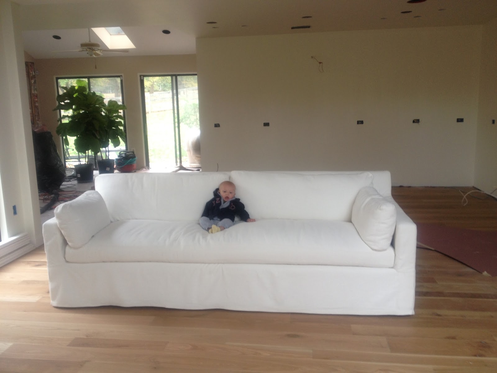
...And our sofa arrived!! wahooooooooooooo
 
This is my "little louie" enjoying it:
 
{poor Luke has a nickname from his big brother that's stuck!! hahahaa}
 
Our kitchen will be going in behind the sofa so we'll just have one big open room for living & eating.  (what we do best ;)
 
I pulled in some more furniture in so we can enjoy the room.  It's so open & airy!! (and empty!!)
...But I'm really happy just to have somewhere to sit down there.  The white sofa is in an indoor-outdoor linen.  I tested the sample with greesy tomato sauce... I smeared it all over the sample to make sure it would wash off.  It did.  We'll see how it fares at our place.  A wet sponge is supposed to do the trick.
 
And... we went to the luxe magazine (DC) launch party last night...


The first issue is beautiful and I'm so excited to have a new design magazine in DC!!  The quality of the magazine /paper itself is amazing too... reminds me of those thick glossy Veranda covers.  Photographer Greg Powers is coming over to our house Monday to take some pictures of me in my new "studio" (i.e. very messy office ;)  for the "stylemaker" section in the next issue of luxe.  We met him last night & he really sweet so it shoud be fun.  (I feel pretty awkward when I'm having my photo taken alone so nice people make it much better ;)
 
Here's a quick pic of Dave & I heading out to the party:
 
{ignore the scary eyes}
 
Have a great day!!


If you'd like help creating a home you absolutely love, contact me about our design services.